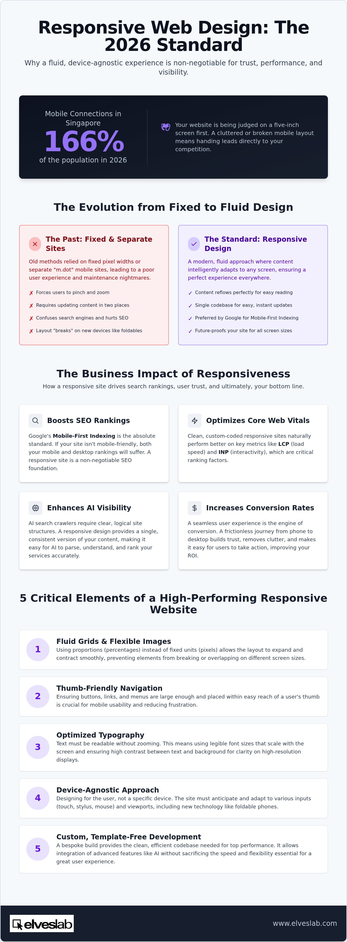
With active mobile connections in Singapore reaching a staggering 166% of the population in 2026, your website is almost certainly being judged on a five-inch screen first. If your layout looks cluttered or "broken" on a smartphone, you aren't just losing clicks; you're handing your leads directly to the competition. Mastering responsive web design Singapore is no longer a luxury or a "nice-to-have" feature. It's the fundamental infrastructure required for trust, performance, and AI-driven visibility in our fast-paced digital economy.
We understand that technical jargon like breakpoints and fluid grids can feel overwhelming, especially when you're trying to weigh the cost of a redesign against the actual ROI. It's natural to worry about the complexity of the process. However, a site that fails to adapt to the user is a growing liability. This guide will show you how responsiveness transforms your user experience and secures your search engine rankings. You'll learn how to evaluate your current digital presence and find a reliable partner to build a bespoke, high-performance site that keeps you ahead of the curve.
Key Takeaways
- Understand why fluid grids are the gold standard for 2026 and how they provide a superior experience compared to outdated mobile-only subdomains.
- Learn how responsive web design Singapore directly impacts your search rankings through Google’s mobile-first indexing and Core Web Vitals optimization.
- Discover the strategic differences between responsive and adaptive design to ensure your site remains functional across all future hardware.
- Identify the essential elements of mobile usability, including thumb-friendly navigation and typography optimized for high-resolution screens.
- Explore how custom, template-free development allows you to integrate advanced features like AI video generation without sacrificing site speed.
What is Responsive Web Design and Why is it Essential in 2026?
If you've ever tried to pinch and zoom on a website just to read a single sentence, you've experienced the failure of fixed design. We define What is Responsive Web Design as a fluid, intelligent approach where your content adapts instantly to any screen. Unlike the clunky "m.dot" mobile sites of the past that forced users onto a separate, stripped-down URL, modern responsiveness ensures your full brand experience remains intact. It uses what we call a fluid grid. Think of a fluid grid like water. If you pour water into a glass, it takes the shape of the glass; if you pour it into a bowl, it adapts. A fluid grid does the same for your website, using proportions instead of fixed measurements to ensure every element stays in its right place.
Maintaining an old-fashioned mobile-only site was like trying to run two different businesses at once. You had to update content in two places, and search engines often got confused about which version to show. Modern responsive web design Singapore removes that headache. By using a single codebase, you ensure that every update you make is reflected everywhere instantly. This simple shift in logic ensures your site looks intentional and polished, regardless of whether it's viewed on a laptop or a handheld device.
The shift in 2026 has moved us into a device-agnostic era. We no longer design for "the desktop" or "the mobile phone." We design for the user. This means your site must anticipate various input methods, from touchscreens and styluses to traditional mice. If your design isn't flexible, you're essentially locking out a portion of your audience before they even see your first offer.
The Evolution of Screen Sizes in Singapore
Singapore's tech market is fast. Professionals here are early adopters of foldable devices that switch from phone to tablet ratios in the blink of an eye. Generic templates fail here because they can't handle these sudden changes in viewport size. When a layout breaks, your text becomes a jumbled mess and your professional image suffers. Responsive web design is the bridge between your brand and your customer’s hardware.
The Cost of Non-Responsiveness
Poor responsiveness is the fastest way to spike your bounce rate. If a user can't click a button or read a menu, they'll leave within three seconds. This behavior destroys your brand trust instantly. In 2026, a website that doesn't work on mobile is viewed as a sign of a business that doesn't care about its customers. Slow-loading elements on mobile devices further hurt retention, making it impossible to convert visitors into loyal clients. Investing in a high-quality responsive web design Singapore strategy isn't just about aesthetics; it's about protecting your bottom line.
The Business Impact: How Responsiveness Drives SEO and ROI
Google’s mobile-first indexing is no longer a suggestion. In 2026, it's the absolute standard for digital visibility. If your site fails the mobile test, your desktop rankings will vanish alongside your mobile ones. This reality makes responsive web design Singapore a non-negotiable part of your SEO strategy. Google specifically tracks Core Web Vitals such as Largest Contentful Paint (LCP) and the newer Interaction to Next Paint (INP) to judge your site. Responsive sites built on clean, custom code naturally perform better on these metrics. They load faster and react more smoothly to user input, keeping your search rankings high.
AI-powered search engines now dominate the landscape. These tools require a clear, logical site structure to parse your data accurately. A responsive architecture provides this clarity by offering a single, consistent version of your content. When your site is built to be device-agnostic, AI bots can easily map your services without getting lost in redirect loops or separate mobile subdomains. This structural integrity is what separates market leaders from those struggling to stay relevant in a smart, automated world.
Seamless user experience (UX) is the engine behind conversion rate optimization (CRO). When a visitor enjoys a frictionless journey from their phone to their tablet, they're far more likely to complete a purchase or fill out a lead form. A responsive site removes the "clutter" that often plagues mobile views, allowing your call-to-action buttons to stand out clearly. High performance leads to high trust.
Search Engine Optimization in the AI Era
Choosing custom web design Singapore ensures your site has the technical "cleanliness" AI crawlers crave. Separate mobile sites often lead to duplicate content penalties, which dilute your authority. By maintaining one URL, you keep all your backlink power in one place. It’s also helpful to grasp the technical differences in Responsive vs. Adaptive vs. Mobile-First implementations. This knowledge helps you build a site that isn't just a container, but a strategic business asset.
Maximizing Your Marketing ROI
Your website is the final destination for every campaign. If you’re working with a social media marketing agency Singapore, your landing pages must be flawless on mobile. Most social users browse on their phones; a broken layout means a lost conversion and wasted ad spend. Managing a single, responsive site also reduces your long-term overhead. You don't need to pay for double the updates or double the hosting fixes. A bespoke, future-proofed site is an investment that pays for itself through higher retention. You can explore our custom solutions to see how we prioritize performance over pre-made templates.
Responsive vs. Adaptive vs. Mobile-First: Which is Right for You?
Choosing the right technical framework determines how your brand survives the next five years of hardware innovation. Responsive design uses fluid grids to scale content proportionally. It's the gold standard for responsive web design Singapore because it handles the infinite variety of screens without needing a separate layout for every new phone. Adaptive design, by contrast, uses fixed "snapshots" for specific screen sizes. While adaptive can offer more control, it's often more expensive to maintain as new hardware hits the market. For most Singaporean SMEs, the fluid approach offers the best balance of longevity and cost-efficiency.
Mobile-first isn't just a technical spec; it's a design philosophy. It forces you to prioritize your most critical information for the smallest screens before expanding to larger monitors. This approach drives SEO and ROI by ensuring your core message is never lost in a sea of desktop-only sidebar clutter. With over 64% of Singapore's web traffic originating from mobile devices, starting with the small screen ensures you don't alienate your primary audience. It makes your site faster, leaner, and more effective at converting casual browsers into paying customers.
Why Custom Architecture Beats Templates
Templates are often packed with "bloat"—excess code meant to cover every possible use case. This extra weight slows down your site and hurts your mobile performance metrics. By choosing custom software development, you strip away the unnecessary scripts. You get a lean, high-performance architecture tailored specifically to your business needs. Custom builds allow us to set precise breakpoints based on the actual devices your Singaporean audience uses most. Lean code wins. It ensures a flawless experience where generic themes often stumble and fail to load correctly on high-resolution screens.
Choosing Your Strategy for 2026
Your choice depends on the complexity of your digital presence. A simple corporate brochure might thrive on standard responsiveness, but a complex portal or high-traffic store needs more precision. If your goal is online sales, e-commerce development Singapore requires a bespoke responsive approach to handle secure checkouts and heavy product catalogs across all devices. High-traffic sites can't afford the layout shifts that come with cheap templates. A bespoke foundation ensures your site remains a reliable revenue generator as user habits evolve. It's about building a site that works for your business, not forcing your business into a pre-made box.
For brands that require specific e-commerce expertise, Digital Junction offers tailored Shopify and WooCommerce solutions that ensure your store remains responsive and high-performing regardless of device.
High-performing responsive web design Singapore isn't just about shrinking a desktop layout. It's about engineering a site that feels native to every device it touches. To achieve this, we focus on five technical pillars that ensure your business remains accessible and professional. First, we prioritize the thumb zone. Since most users browse one-handed, we place critical call-to-action buttons within the natural reach of the thumb. Second, we implement scalable typography. Using fluid type scales ensures that your headlines are bold on desktops but don't overwhelm small mobile screens. Readability is never sacrificed for style.
The third pillar is intelligent image scaling. In 2026, we use modern formats like WebP and AVIF to maintain crisp visuals at a fraction of the traditional file size. We also leverage SVGs for icons to ensure they stay sharp at any resolution. Fourth, we focus on local infrastructure. Fast load times require reliable web hosting in Singapore to minimize latency for your domestic audience. Finally, we move beyond browser simulators. True quality assurance requires testing on physical foldable phones and tablets to catch the subtle layout shifts that software tools often miss.
Navigation and User Interaction
The traditional hamburger menu is losing its effectiveness for complex sites. It hides your navigation and adds an extra click to every journey. Instead, we often recommend bottom tab bars or floating action buttons that keep your primary services visible. Spacing is just as important as size. We design touch targets with enough "breathing room" to prevent frustrating misclicks. Micro-interactions are the key to 2026 user engagement. These small visual cues, like a button changing color slightly when tapped, provide the tactile feedback mobile users expect from a premium brand. To see these premium design elements in practice, you can visit Insight Multimedia and discover how they integrate creative micro-interactions into their responsive projects.
Performance and Speed Optimization
Site speed is a massive competitive advantage. A faster, leaner site significantly improves your ecommerce seo singapore rankings, as search engines prioritize user experience. We utilize server-side optimization to ensure your site only sends the necessary data to the user's specific device. Bespoke CMS development allows for much leaner code compared to generic platforms. By avoiding the bloat of third-party plugins, we keep your site agile and secure. You can explore our custom development solutions to see how we blend high-speed performance with unique brand aesthetics.
Future-Proofing Your Presence with Elves Lab Custom Solutions
At Elves Lab, we don't believe in shortcuts. We build bespoke, responsive sites from the ground up because we know that generic templates can't keep up with the 2026 Singapore market. When you invest in responsive web design Singapore through our team, you're getting a unique architecture designed specifically for your brand's goals. This "from scratch" philosophy eliminates the hidden code bloat that often slows down your competitors. It allows for a level of technical precision that ensures your site looks intentional and polished on everything from ultra-wide monitors to the latest foldable phones.
We also integrate cutting-edge features like AI video generation Singapore directly into our responsive layouts. These aren't just bolted-on extras; we optimize how these heavy assets load to ensure they provide an immersive experience without tanking your Core Web Vitals. Our team understands that a high-performing site needs constant attention. The tech landscape in Singapore evolves at a breakneck pace, and we provide the continuous testing and maintenance necessary to keep your digital storefront running at peak efficiency long after the initial launch.
Beyond the Launch: Evolution and Growth
Launching your site is just the first step in our partnership. We use real-time performance data to refine your responsive layouts, identifying exactly where users might encounter friction. By integrating your SEO, web hosting, and development under one roof, we ensure that every technical update supports your broader marketing strategy. We're already preparing our clients for the next wave of wearable and ambient computing, making sure your content is ready for screens we haven't even seen yet. This forward-thinking mindset is what keeps your business ahead of the curve.
Ready to Transform Your Digital Presence?
In 2026, a "good enough" website is a business liability. Bespoke responsive design is your most powerful tool for securing a competitive edge and building lasting brand trust. It’s the difference between a visitor who bounces in frustration and a customer who converts with ease. We’re here to help you navigate this transition and take the technical weight off your shoulders. Our experts are ready to provide a custom audit of your current site to show you exactly where you can improve. Schedule your custom web design consultation with Elves Lab today! and let's build a digital foundation that grows with your business.
Secure Your Digital Competitive Edge for 2026
In 2026, your website is often the only handshake your business gets with a potential lead. We've explored how a fluid, device-agnostic approach is no longer just a technical choice but a strategic necessity for survival. By prioritizing thumb-friendly navigation and lean, custom code, you ensure that your brand remains accessible and professional on every screen size. Mastering responsive web design Singapore allows you to capture high-intent traffic while protecting your SEO rankings from the penalties of fragmented layouts. Transitioning to a responsive architecture isn't just about fixing a site; it's about future-proofing your revenue.
Choosing a partner who understands the local digital ecosystem makes all the difference. With over 25 years of bespoke development expertise in Singapore, Elves Lab provides 100% custom-coded solutions that avoid the restrictions of generic templates. We offer comprehensive support that spans from initial design to long-term SEO and hosting, ensuring your site evolves as fast as the technology around it. Don't let a clunky mobile view hold your growth back. It's time to build a digital foundation that truly reflects your brand's excellence. We're ready to help you scale.
Get a Custom Responsive Web Design Quote from Elves Lab
Frequently Asked Questions
What is the difference between responsive and mobile-friendly web design?
Mobile-friendly is an umbrella term that simply means a site is readable on a phone. It often relies on a separate mobile URL or a simplified, rigid layout. In contrast, responsive web design Singapore uses a fluid grid system to ensure one single website adapts perfectly to every device. This approach is more efficient for SEO and maintenance because it eliminates the need for duplicate content across different versions of your site.
How much does it cost to make a website responsive in Singapore in 2026?
The investment for a responsive site depends on your specific business goals and the complexity of your features. While basic template-based options exist, they often lack the performance needed for long-term growth. We prioritize bespoke development because it removes restrictive code bloat. This ensures your site remains fast and functional as your business scales. Investing in a custom-coded foundation provides a much higher ROI compared to cheap, rigid alternatives that require frequent fixes.
Will a responsive design improve my Google ranking in Singapore?
Google’s mobile-first indexing makes responsiveness a primary ranking factor. In 2026, the search engine prioritizes the mobile version of your content to determine where you rank. A responsive web design Singapore strategy provides the technical clarity and speed that search bots crave. By optimizing your Core Web Vitals through a fluid layout, you're signaling to Google that your site is trustworthy and user-friendly. This leads to higher visibility and more organic traffic for your brand.
Does responsive design affect website loading speed?
Responsiveness can improve speed if implemented correctly. Many generic templates are heavy because they include code for every possible feature. A custom-coded responsive site is different. It only includes the scripts you actually need, making it significantly faster. When combined with optimized hosting and modern image formats like WebP, a responsive layout ensures your visitors don't wait more than two seconds for your content to appear on their screens. Efficiency is our priority.
Can I convert my existing template-based site into a responsive one?
While you can try to retrofit an old site, it’s rarely the best move. Rigid templates are built with fixed widths that conflict with fluid responsive logic. Attempting to "convert" them often leads to clunky code and a poor user experience. We usually recommend a custom rebuild. This allows us to create a lean, device-agnostic architecture from scratch, ensuring your brand looks professional on every new device that enters the Singapore market.
How do I test if my website is truly responsive?
You can start by resizing your browser window to see if the content shifts smoothly. However, browser simulators don't always capture the tactile experience. We recommend testing on physical devices, especially foldables and high-resolution tablets used by professionals in Singapore. Check if buttons are easy to tap with a thumb and ensure that typography remains readable without zooming. To gain even deeper insights into how users navigate these screens, professional behavioral research from Ergoneers can help identify exactly where attention is focused. Real-world testing is the only way to guarantee a truly high-performing user journey.
B2B decision-makers in Singapore are constantly on the move. They often conduct their initial research on smartphones during commutes or between meetings. If your B2B portal looks broken on mobile, you're losing credibility instantly. A professional, responsive presence shows that your company is modern and reliable. It facilitates a seamless transition for your clients as they move from mobile research to desktop procurement, keeping your sales funnel moving without technical friction. Trust starts with usability.
How often should I update my responsive design breakpoints?
If your site uses a truly fluid grid, you won't need to manually update breakpoints for every new phone release. A fluid system scales proportionally based on percentages rather than fixed pixels. However, it's wise to perform a technical audit every year. This helps you account for major shifts in hardware trends, such as the rise of ultra-wide monitors or new foldable screen ratios. Staying proactive ensures your site remains a high-performance business asset.
Disclaimer
AI-Generated Content Disclaimer
The articles, blog posts, and informational content published on this website may be generated or assisted by artificial intelligence (AI) tools for search engine optimisation (SEO), content discovery, and informational purposes.
While reasonable efforts are made to ensure the content is relevant and useful, the information provided may not always be accurate, complete, current, or applicable to your specific circumstances. The views, opinions, statements, recommendations, or interpretations expressed in these articles are generated based on publicly available information and do not necessarily reflect the views, opinions, positions, policies, or professional advice of our company, its management, employees, partners, or affiliates.
The content should not be construed as legal, financial, medical, technical, professional, or other specialised advice. Readers are encouraged to independently verify any information and seek professional consultation where appropriate before making decisions based on the content provided.
Our company shall not be held liable for any loss, damage, claim, or consequence arising directly or indirectly from the use of, reliance upon, or interpretation of any AI-generated content published on this website.
By accessing and using this website, you acknowledge and accept that certain content may be generated or assisted by AI technologies and is provided on an "as is" basis for informational and SEO purposes only.